Life just got a little better
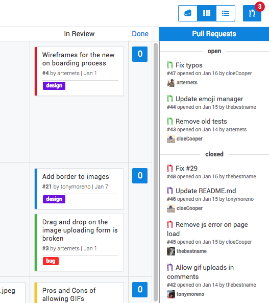
Pull requests are no longer part of the main board. Instead, pull requests now appear in a list on the right side of the board. The pull request list shows all open and closed pull requests for whatever milestone you’re looking at. At the top right of the page there is a pull request icon with a red badge to let you know the number of open pull requests (so you can drop everything else going on in your life and immediately merge your coworker’s changes). Clicking the icon will show/hide the pull request list.

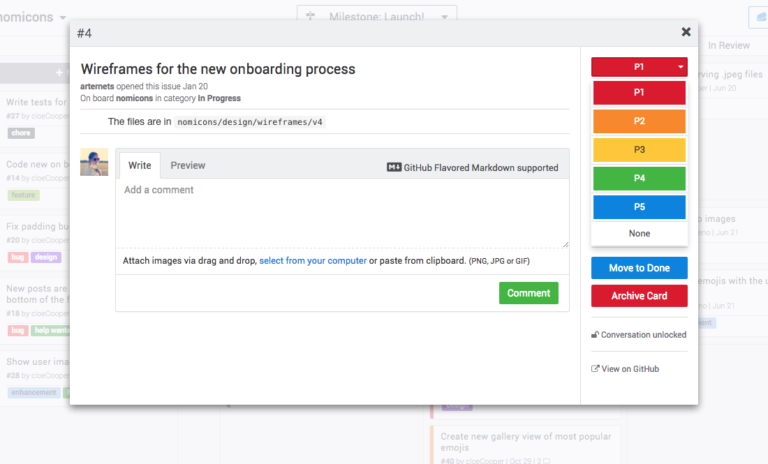
Another change that may make your day is that you can now change how priority is represented on a Zube card. Previously, priority was labeled “Code” (Code Red, Code Orange, etc.). Now, the default naming convention is P1, P2, P3, P4, and P5. Not to worry, if you love having only colors then you can change it back on the board’s settings page. You can also choose an urgency scale with the names Blocker, Critical, Major, Minor, and Trivial, if that’s your thing.

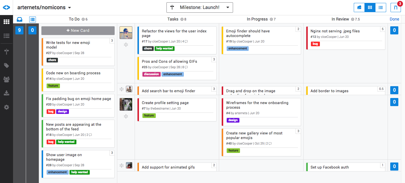
If you’re often looking at your Zube board, wishing you could collapse a user row because that team member just really isn’t that important, then you’re in luck! You can now collapse and expand user rows by clicking on the collapse/expand icons next to their avatar.

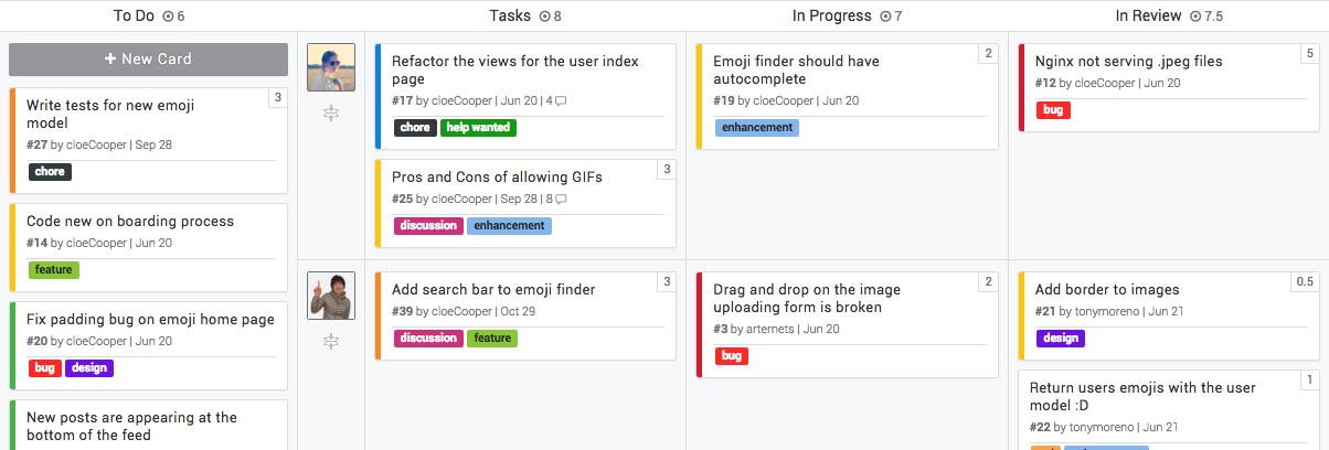
There’s also one last small thing that makes life better for everyone using points (story points). The point totals are now displayed at the top of every board column. Having point totals makes it easy to see if one stage of your workflow is getting overloaded. When trying to maximize for workflow efficiency, eliminating bottlenecks is one of the most important things you can do. If you’re currently not using points (story points) and would like to enable them, you can do so on the board’s setting page.

