Beautiful and powerful charts
Our new charts provide insights into your project like never before. There are several new charts that let you dig deep into what’s being accomplished. The truly wonderful thing about the new charts is that they give you an overview of all your data in one place, no matter where the work is being done. If you have GitHub sources linked to your project, then your GitHub data is right there too.
Burndown, Burnup, and Velocity
If you’re using sprints, and we suggest that you do, you’ll be delighted to see that we’ve added card counts to the Burndown chart. Zube will automatically track card counts for all of your sprints going forward. As a note of caution, we just started collecting card count data so don’t worry if card counts for old sprints are flat lines.

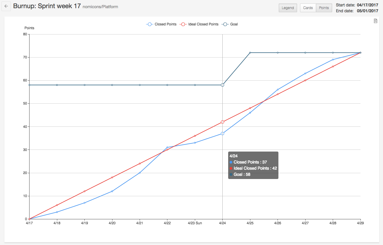
We’ve added a Burnup chart, which is similar to a Burndown chart except that there’s a goal line at the top instead of working toward zero. The great thing about the Burnup chart is that it allows you to see changes to your goal. In an ideal world, your goal would never change during a sprint, but in the real world it often does. With the Burnup chart you’ll be able to see exactly when cards or points were added to your sprint and by how much your goal changed as a result.
An important notion in Agile, and particularly Scrum, is the idea that your team’s efficiency should be improving over time. The first step towards increasing your team’s efficiency is to measure how much work your team is doing per week. A good way to display this information is with a velocity chart. Zube’s new Velocity chart shows the total cards or points closed per sprint so you can get a clear picture of how much work is getting done in that fixed time period. Your sprints are displayed side by side so you can make sure your team is improving over time (or at least holding steady).
Throughput and Users Throughput
Sometimes you just want to see a raw measure of what’s getting done. The Throughput chart shows you how many cards or points are closed each day. There’s a powerful set of filters that let you drill down to see just what you’re interested in.

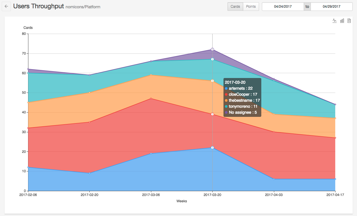
The final chart we added is the Users Throughput chart. The Users Throughput chart lets you see how many cards or points each team member is closing per week. It is a stacked area chart, segmented by user, so it’s easy to see how everyone is doing over time. The Users Throughput chart makes it easy to see who is getting bogged down or which team member has really stepped up their game.
