A design that materialized from our obsession with usability
We didn’t sit down last week to give Zube a fresh new look. All we wanted to do was to make the cards on the kanban board easier to read. But once we started, we quickly became obsessed with how good design could make it easier for you to manage your entire project. Here’s an overview of what we improved.
The kanban board
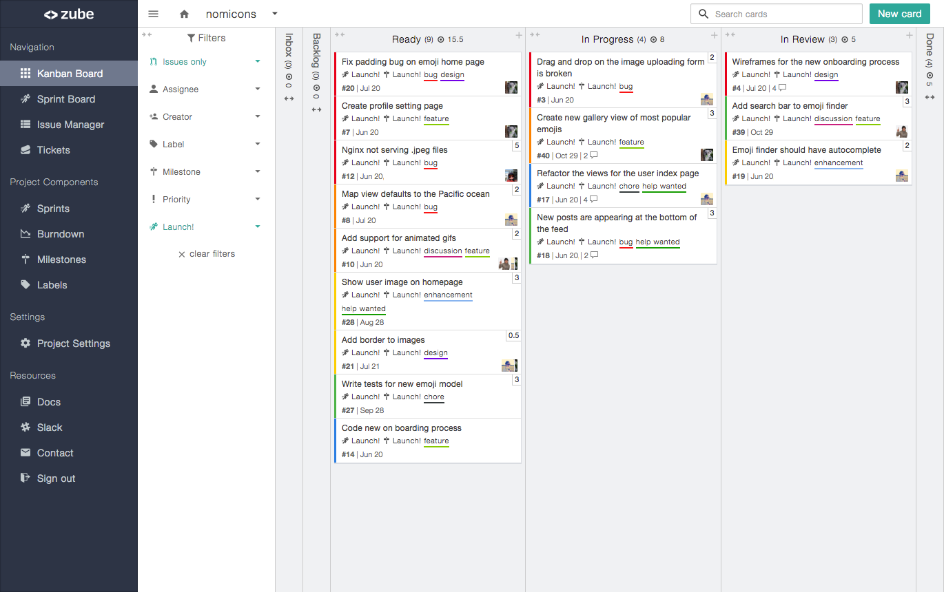
Must see more cards! We got rid of the space between the cards within their categories so they butt up against each other and form a column. Not only do more cards fit on the screen, but they are also easier to read because the new design eliminates grid illusion .

We also moved the board filters from the top of the board over to a sidebar on the left. What’s more, we made board filtering more powerful by adding the ability to filter on priority and creator! It’s now easier to filter out the noise and focus on high priority issues.
The issue manager
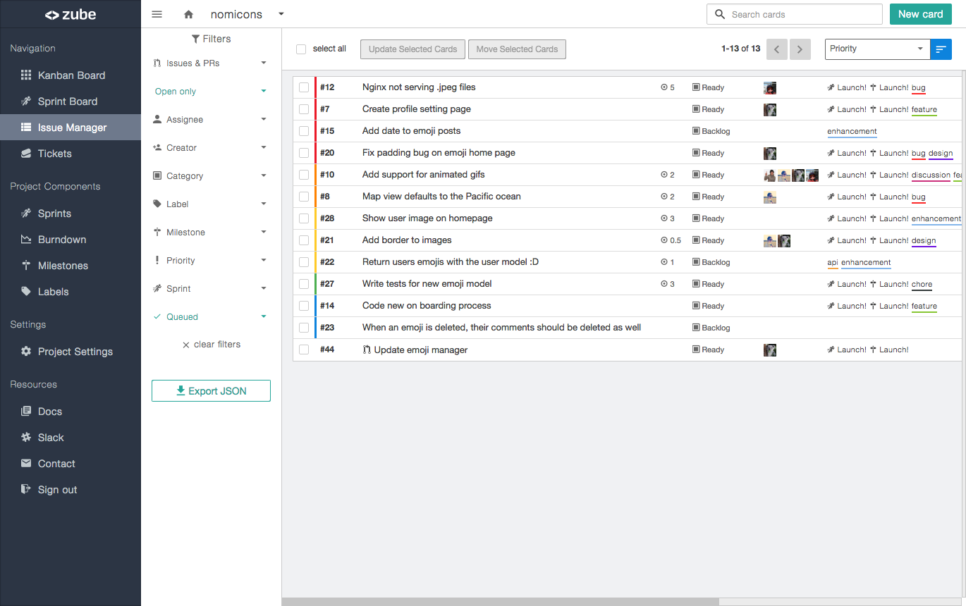
The issue manager has always been a super powerful way to manage your issues (hence the name). You can quickly filter and search across your entire project and perform bulk actions, even if your project is made up of multiple repositories. What’s been missing, until now, was a design that highlighted just how powerful the Issue Manager really is, so the new Issue Manager design is all about data density and scannability. Each issue only takes up a single line with the most important information up front. Basically, it’s an awesome table :)

